

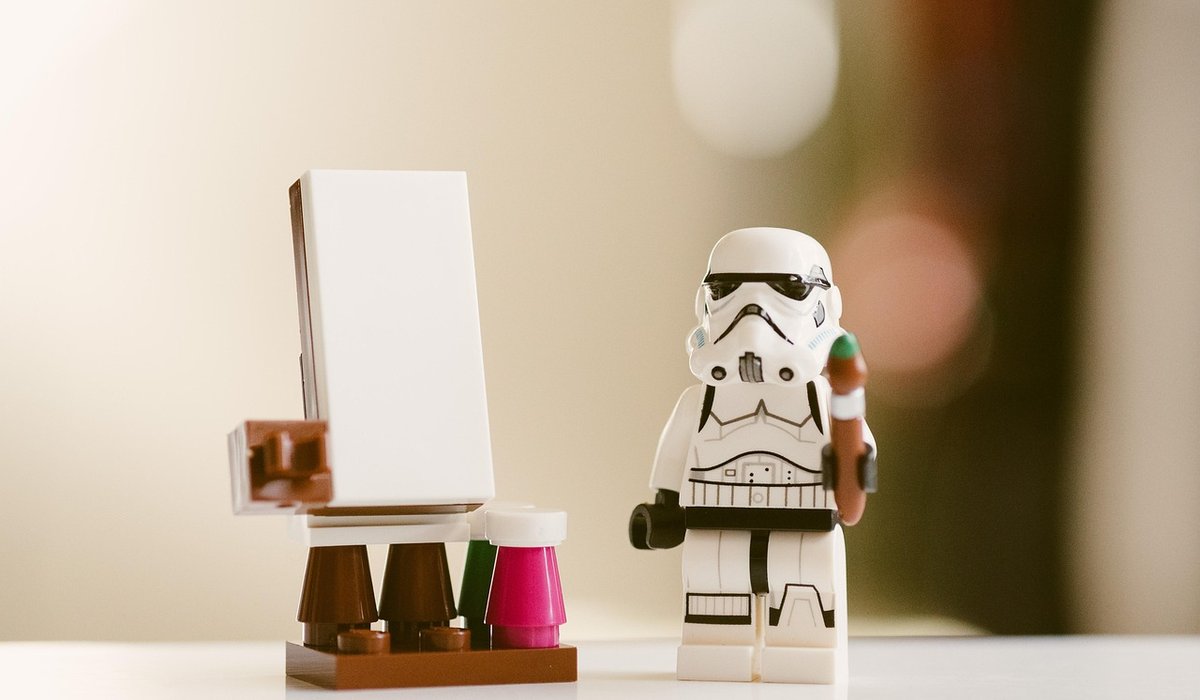
A Beginner's Guide to Game Concept Art
What Concept Art Is Actually For
Concept art is not finished illustration, and that distinction matters more than any brush pack you will ever download. Its job is to answer questions quickly and cheaply so that nobody spends three months building the wrong thing. Does this castle read as welcoming or hostile? Can a player tell your four factions apart from across a room? Where does the light come from?
Every piece of concept work should have a question attached. If you cannot say what yours is asking, you are probably just drawing. That is fine as a warm-up, but it is not the job. Treat each image as a decision made visible, and give yourself permission to make it ugly as long as it is clear.
Thumbnails: Thinking in Shapes
Start small. Genuinely small — no bigger than a postage stamp, roughly 3cm across. At that size you physically cannot render detail, so you are forced to solve the only thing that matters at a distance: silhouette and composition.
Set a timer for sixty seconds per thumbnail and do at least twenty before you allow yourself an opinion. Work in flat grey shapes, then block in three values: light, mid, dark. If a thumbnail reads clearly as a mysterious forest shrine when you squint at it, it will read even better when it is five metres wide. If it reads as mud, no amount of later detail will save it.
- Use one brush and no colour to begin with.
- Vary your shapes — tall, wide, clustered, sparse.
- Squint constantly, or shrink the canvas down to 10% and back up.
- Circle the three thumbnails that still work when you look away and back.
Mood Boards: Building a Visual Vocabulary
A mood board is not a scrapbook of things you like. It is a working reference library for one specific project, and it should be ruthlessly edited. Gather twenty to forty images, then throw half away.
Look for texture and pattern as much as subject. A board for a rain-slicked market district might include wet slate, peeling signage, faded awnings, oil on puddles, and the specific green of old copper. Photograph your own local streets, charity shop crockery, moss on a wall — original reference beats borrowed reference every time, because nobody else will have it.
Annotate as you go. A short note like "this warm ochre for the player's faction only" turns a pretty picture into a usable instruction for the rest of the team.
Colour Studies: Cheap, Fast and Revealing
Once a thumbnail survives, blow it up and paint a colour study over it in twenty to thirty minutes. Do not clean it up. The point is to test a palette before you commit to it.
Try a limited palette first: one dominant hue, one supporting hue, and one accent used sparingly. Roughly 70/25/5 works well for most key art. Then run three variations of the same composition — warm and inviting, cold and threatening, sickly and poisoned. Same shapes, different mood. This exercise is the fastest way to discover which story you actually want to tell.
- Keep a greyscale copy beside your colour version to check your values have not collapsed.
- Check your palette in a tiny 100-pixel-wide version, as that is how it will be seen in a storefront or on a phone.
- Note your hex codes or swatches while they are fresh — future you will be grateful.
Turnarounds, Props and the Handover Pack
Once a design is approved, you owe the production team clarity rather than beauty. A simple turnaround — front, side, back — plus a callout sheet showing how seams, straps, weapons or signage are constructed will save hours of guesswork. Label everything. Draw things at their relative sizes so nobody builds a door that a character cannot walk through.
Props deserve the same treatment as characters. A single well-considered object — a lantern, a fishing net, a chipped mug — can carry a whole setting's tone. Paint it against a neutral background, state its dimensions, and note the material it is made from.
A Workable Weekly Routine
Beginners often stall because they try to make one beautiful image instead of many honest ones. Flip it. Aim for five thumbnails a day, one mood board and one colour study a week, and one finished design sheet a fortnight. Keep everything in a single sketchbook or folder so you can flip back and see your own progress.
Study the work you admire by copying it, then immediately draw the same subject from your own imagination. That gap between the two is exactly what you need to practise next. Be patient, keep your early work, and remember that the scruffy thumbnail you nearly threw away is often the one that ends up shaping the whole game.

About The Author
Drawing, guessing and creative challenge games that work well at social gatherings, with notes on pace, group size and rule clarity.


Board Games
-
Practical methods for creating durable, attractive markers from card, wood or clay when testing ideas before professional manufacturing.


Video Games



-

Long established fact that a reader will be distracted
-

Long established fact that a reader will be distracted
-

Long established fact that a reader will be distracted



Card Games
Karla Gleichauf
12 May 2017 at 05:28 pm
On the other hand, we denounce with righteous indignation and dislike men who are so beguiled and demoralized by the charms of pleasure of the moment
M Shyamalan
12 May 2017 at 05:28 pm
On the other hand, we denounce with righteous indignation and dislike men who are so beguiled and demoralized by the charms of pleasure of the moment
Liz Montano
12 May 2017 at 05:28 pm
On the other hand, we denounce with righteous indignation and dislike men who are so beguiled and demoralized by the charms of pleasure of the moment